Hello, this is news jelly.
The seventh international article on data visualization is related to visual packages for an agency.
<VISUALIZING DATA>
January 27, 2015 Andy Kirk
New Visual Package for Chicago Planning Agency
There is a clever new project created by Clever Franke ‘s team, which has created a digital package of visual content on the theme of ‘liquidity, economy and survival’ for CMAP , a regional planning agency in the Chicago metropolitan area .
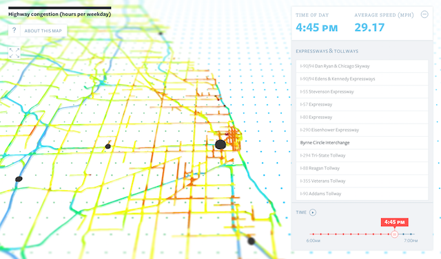
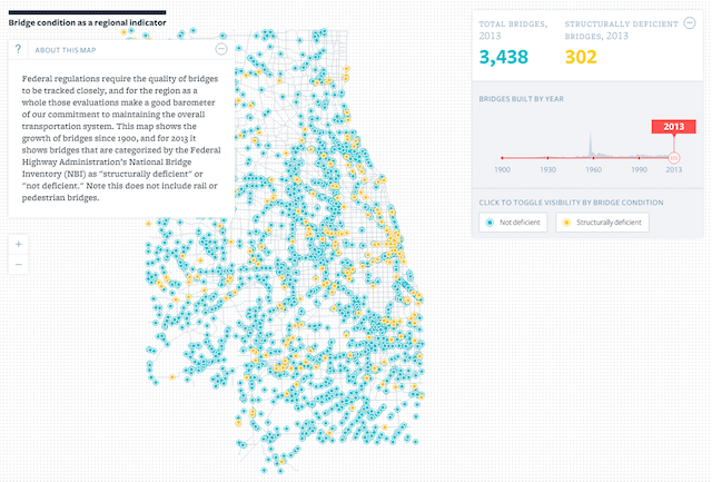
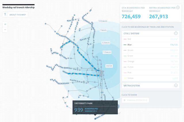
The overall objective is to develop an innovative approach to data visualization and information content. The project consists of a series of small places that contain the past, present and future of Chicago’s roads, plans for transportation, cargo transportation, and how they all go forward.
Small places are the first to aim at educating and influencing stakeholders from political opinion makers, news media and business pioneers. Another important point is that the overall political world needs access to everyday life-related content without having to hire a professional planner. Small places are an integral part of the agency’s commitment to transparency and public favor.
Many digital projects over the last few years of this kind of work, over a long period of time or in a variety of ways, represent a mix of textual content, embedded images, photo-images, and interactive work composed of these four key chapters.
With regard to the table of contents of the “transport approach” which provides a repeat of the overall shaking Roy Lichtenstein vibe with Moritz Stephaner’s Stadtbuilder and ” A Nation Divided ” to truly visualize a number of carefully selected mapping layers , like the approach they took (incidentally, a very nice profile CF teams worthless ( Profiles Check out the)!).
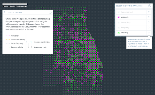
Each chapter has the same structure with a short intro, followed by a simple chart showing the central interactive piece, the video depicted as text, and the last associated statistical indicator.
In addition to being a great visualization work, I think the project emphasizes the importance of the increasing number of good pictures and images – including high quality and always unauthorized but licensed images. Moreover, such channels are deployed and integrated into digital work involving some fairly critical design choices. As technology continues to blur the boundaries between visualizations, as I feel, infographics and digital content will require us to understand the best practices surrounding communication across charts.

A good description of the process, with more screenshots of Clever Franke’s design work, can be found here .
News jelly that delivers quick news with big data, public data, and social data
