Hello, this is news jelly.
This article is an overseas article related to data visualization.
(Source: http://goo.gl/mjZTVP )
Modified August 21, 2015
This amazing diagram will change the way you view the world economy.
Here is a very nice diagram from HowMuch.net, which took a little time to understand because it was a bit odd. The way this diagram works is to visualize the output of the entire world economy in a circular shape. It then divides the circle into many color parts that represent the economies of each major country. And then we divide the color of each country into three chunks. One of the lumps is manufacturing, one is service, and one is agriculture.
Check it out:
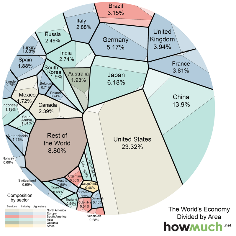
(* Note: Service industry, industry (manufacturing), agriculture)
You can find out the wonderful facts here.
- For example, compare the United States and China. The US economy is much larger than the Chinese economy, but the US manufacturing sector is comparable in size and the agricultural sector in China seems to be a bit larger. The service industry is leading the rest of the margin.
- Britain and France have similar sizes in the overall economy. But French agriculture has a slightly larger pie area.
- Despite Russia’s role as a threat throughout the world, the economy of this country is producing less than Italy. If all the different European countries are combined, Russia looks sad.
- You often hear the phrase “China and India.” But here you can see that the two Asian giants look very different economically.
- South Africa, the only African continent on this list, has a smaller economy than Colombia.
Data visualization specialist, news jelly http://newsjel.ly/
Big data analysis based on data visualization with a flimsy idea
Storytelling content for the world
Facebook address: www.facebook.com/newsjelly
