Hello, this is news jelly.
This article is an overseas article related to data visualization.
<TNW>
Articles dated April 22, 2015
14 Best Visualization Tools
The original data is tedious and difficult to understand when in its original state. Adding visualization to this data allows you to get something that everyone can easily digest. You can not only understand quickly through visualization, but also observe interesting patterns.
To make the tedious task of creating beautiful charts and maps easy, I have gathered the best tools for data visualization. I divided this list into two big parts. The first part is a tool for developers that requires coding, and the second is a tool that does not require coding.
So let’s get started!
For Developers Developers for tools
D3.js
D3.js is short for “Data Driven Documents” and it is also the first tool to think about data visualization. It uses HTML, CSS, and SVG to create amazing charts and diagrams. If you can imagine a visualization, you can implement it with D3. It is characterized by being packaged, interactive and beautiful. Most are free and open source.
D3 can not send pre-made charts out, but it has a nice gallery function. There are two important considerations regarding D3.js. It has a steep learning curve and is only compatible with modern browsers such as IE 9+. So please only use it if you have enough time and you are not concerned about being posted to an old browser.
FusionCharts
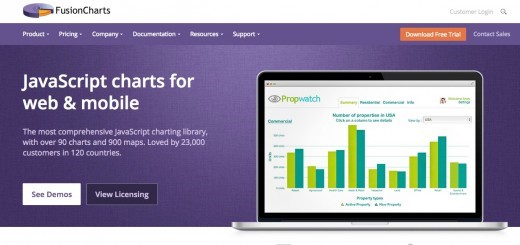
FusionCharts is probably the widest chart and map type of tool. With over 90 chart types and 965 maps, you can find everything you want. In addition to supporting modern browsers, older browsers also support IE6.
FusionCharts는 JSON 형식과 XML 형식을 모두 지원하며, 차트를 PNG, JPEG, SVG, 그리고 PDF로 변환이 가능하다. 또한 비즈니스 대쉬보드와 라이브 데모의 컬렉션을 가지고 있다.
이 차트와 지도들은 모든 기기와 플랫폼에서 구동이 가능하고, 훌륭하게 커스터마이징 되어 있을 뿐만 아니라 아름다운 상호작용도 가지고 있다.
Chart.js
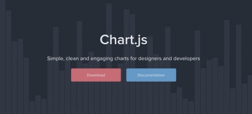
Chart.js는 선, 막대, 극해, 방사형, 파이, 도넛으로 총 6개의 차트 타입을 지원하는 오픈 소스 라이브러리이다. 그러나 이 도구를 선호하는 이유는 여기서 제공하는 6가지 타입이 한 프로젝트를 위한 그래프의 전부이기 때문이다. 만약 적용이 방대하고 복잡하다면, 구글차트나 FusionCharts를 사용하는 것이 용이하지만 작은 프로젝트의 경우 Chart.js가 완벽한 해결책이라고 할 수 있다.
이 도구는 차트를 만들기 위해 HTML5 캔버스 요소를 사용한다. 모든 차트가 즉각 반응하고 플랫 디자인을 사용한다. 또한 이 도구는 최근 떠오르고 있는 가장 유명한 차트 라이브러리 중 하나이다.
Google Charts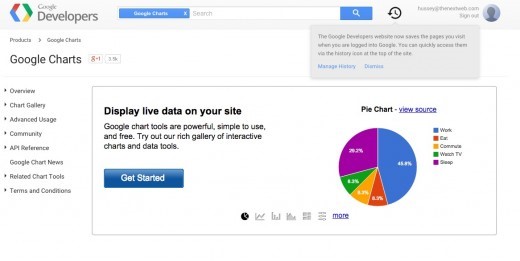
구글 차트는 브라우저 호환성과 아이폰과 안드로이드에서 모두 호환이 가능하도록 HTML5/SVG로 차트를 만든다. 이것은 막대차트, 파이차트, 게이지 차트와 같은 대부분 공통적으로 이용되는 차트 타입을 제공한다. 이 도구는 유연하고 이용자에게 익숙하게 디자인되어 있으며, 갤러리를 통하여 다양한 차트의 사례를 통해 아이디어를 얻을 수도 있다.
Highcharts
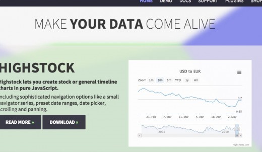
Highcharts는 차트 도구들 중 주요 플레이어 중 하나이다. FusionCharts처럼 다양한 종류의 차트와 지도를 제공한다. 보통차트 뿐만 아니라 이것은 또한 Highstock이라고 부르는 풍부한 주식차트의 다른 묶음을 제공한다.
또한 여기서는 차트를 PNG,JPG,SVG 그리고 PDR로 내보내는 것이 가능하다. 당신은 데모 섹션에서 제공하는 다양한 차트 양식들을 볼 수 있다. Highcharts는 비영리적이거나 개인적 사용에는 무료로 제공되지만, 상업적인 사용을 위해서는 라이선스를 구매해야 한다.
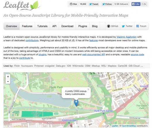
Leaflet
Leaflet은 모바일 인터랙티브 지도를 위해 Vladimir Agafonkin에 의하여 개발된 오픈소스 라이브러리이다. 이 도구는 매우 용량이 작고, 다양한 종류의 지도를 만들 수 있다는 특징을 가지고 있다. 이 도구는 지도를 만들기 위해 HTML5와 CSS3를 사용하고, 대부분의 데스크탑과 모바일 플랫폼에서 작동이 가능하다. 필자는 이 도구에 대하여 “Leaflet은 간결함, 성과, 용이함을 염두에 두고 디자인되었다”고 말하고 싶다.
이 도구에는 생기있는 마커나 적외선 열지도 등 핵심적인 기능을 확장할 수 있도록 다양한 종류의 사용가능한 플러그인을 가지고 있다. 만약 당신이 지도를 포함한 어플리케이션을 개발 할 생각이 있다면 Leaflet을 이용해봐야 할 것이다.
dygraphs
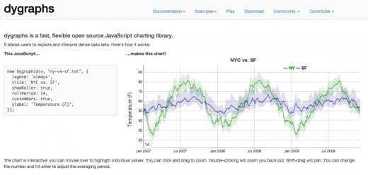
dygraphs는 거대한 데이터 묶음을 다루기 위한 오픈 소스 자바스크립트 차트 라이브러리이다. 이 도구는 매우 빠르고, 유연하며, 이용자 맞춤형 제작이 가능하다. 또한 이 도구는 대부분의 주요 브라우저에서 구동이 가능하며 활발한 커뮤니티를 가지고 있다.
dygraphs는 그것의 틈새 시장을 가지고 있고, 모두를 위한 최적의 솔루션이라고 말할 수는 없다. 그러나 당신이 거대한 데이터를 다룬다면 도움이 될 것이다. 어떤 것이 가능한지 확인하기 위해서는 데모 갤러리를 방문해보는 것을 추천한다.
Non-Developers 비개발자를 위한 도구
Datawrapper
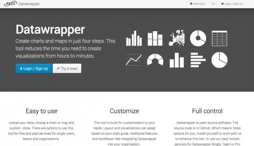
Datawrapper은 인터랙티브 차트를 만들기위한 온라인 도구이다. 만약 CSV 파일을 업로드 하거나, 필드에 직접적으로 붙여넣기하면 Datawrapper가 막대그래프나 선그래프를 비롯하여 관련있는 시각화를 만들어준다. 많은 기자들이나 뉴스 조직들은 그들의 기사에 생생한 차트를 넣기 위하여 Datawrapper를 사용한다. 이것은 매우 이용하기 쉬우며 효율적인 그래픽을 생산해낸다.
Tableau
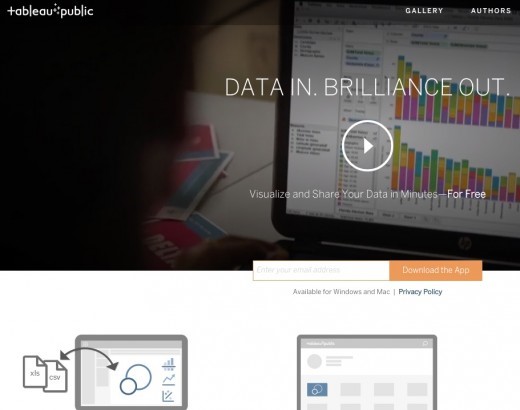
Tableau Public은 다양한 차트, 그래프, 지도 그리고 다른 그래픽을 만드는 것을 도와주는 가장 유명한 시각화 도구일 것이다. 이것은 완벽하게 무료로 제공되는 도구이며, 당신이 만들어낸 모든 차트들을 어떤 웹 페이지에라도 보내는 것이 가능하다. 또한 이 도구는 만들어진 시각화를 게시하는 멋진 갤러리도 가지고 있다.
Tableau가 다른 비슷한 도구들보다 훨씬 더 나은 차트나 그래픽을 제공함에도 불구하고, 필자는 이 도구의 커다란 꼬릿말 때문에 이 도구를 사랑하지는 않는다. 만약 필자에게만큼 이 문제가 크게 느껴지지 않는다면 시도해보는 것이 좋다. 그리고 만약 감당할 수 있다면, 유료 버전을 사용하는 것도 좋다.
Raw
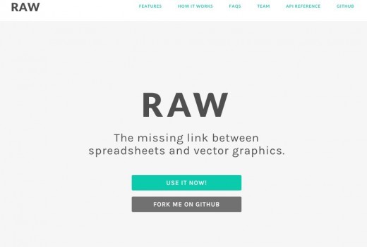
Raw는 스스로를 “스프레드시트와 벡터 그래픽 사이의 잃어버린 고리”라고 정의한다. 이것은 D3.js을 기반으로 만들어졌고, 매우 훌륭히 디자인 되었다. 이것은 또한 당신이 전에 사용해본 듯한 느낌을 가질 수 있을 정도로 직관적인 인터페이스를 가지고 있다. 이것은 오픈소스이고 다른 등록 절차는 전혀 요구하지 않는다.
이것은 16개의 차트 종류를 가진 라이브러리를 가지고 있으며 브라우저에서 모든 작업이 이루어진다. 따라서 당신의 데이터는 안전하다. RAW는 고객 맞춤형일 뿐만 아니라 확장이 가능하고, 새로운 커스텀 레이아웃도 소화가 가능하다.
Timeline JS
이름이 보여주는 것처럼 Timeline JS는 당신이 코드를 쓰는 것 없이 아름다운 타임라인을 만들 수 있도록 도와준다. 이것은 무료이며 오픈소스로 제공되는 도구이며 Time과 Radiolab과 같은 유명 웹사이트에서 쓰이고 있다.
이 도구를 이용해서 타임라인을 만드는 것은 총 4단계로 이루어져 있으며 따라하기 매우쉽다. 또한 이 도구에서 가장 좋은 점은 트위터, Flickr, 구글맵, 유튜브, Vimeo, Vine, Dailymotion, 위키피디아, SoundCloud는 물론 비슷한 사이트들로부터 소스를 얻어 미디어를 삽입할 수 있다는 데 있다.
Infogram
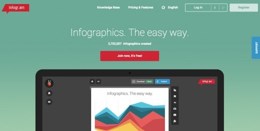
Infogram은 당신이 온라인으로 차트와 인포그래픽을 만들 수 있도록 해준다. 이 도구는 제한적인 무료 버전과 200가지 이상의 지도, 개인 공유 및 아이콘 라이브러리를 포함한 2가지 유료버전으로 제공된다.
It has an easy-to-use interface, and the basic charts are well designed. But what I do not like is a large logo that appears when a user tries to publish a chart on a web page (free version). It would be much better to see it as small text like the Datawrapper.
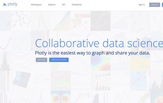
Plotly
Plotly is a web-based data analysis and graphical tool. It supports great chart types with social sharing. The types of charts and graphs supported are not only professionally visible, but they also feel that way. Creating a chart is a matter of loading your information, determining the layout, axis, and so on.
ChartBlocks
ChartBlocks is a great charting tool and another charting tool that helps you create basic charts very quickly. This tool has a limited chart type, but it does not matter because it supports all commonly used charts.
This tool allows you to insert data from a variety of external sources, such as spreadsheets and databases. After you create a chart, you can export it to SVG or PNG, publish it on a website, or share it via social media.
Data visualization is a vast area in which there are many players. I have tried to include only the best tools depending on whether you can code or not. So if you have such a tool because you may have missed your favorite tool, why not comment it out below?
News jelly that delivers quick news with big data, public data, and social data
