# 17. ‘the guardian’ First World War
First World War World War
I
Good morning? News is jelly.
International Interactive InfoGraphics will introduce you to today
‘s
‘First World War’ of the guardian magazine,
It is ‘World War I’
.
* Interactive infographic is a feature that actively draws on the acceptance of information.
It has the advantage of inducing interest through the motion effect, leading to the participation of the audience and thus easily conveying information. It is a documentary-style interactive infographic created by the Guardian Multimedia Project team, which is a global guide to the First World War, dealing with World War I in the form of documentaries. It is the history of the digital storytelling method that the guardian’s unique technology, the exploration report know-how, and the archive are condensed.
So let’s look at it in earnest.
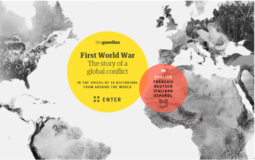
You can choose from seven languages in the red circle on the first page.
It’s also a guardian of the world’s daily newspaper.
Let’s select ENGLISH and click the yellow circle (ENTER).
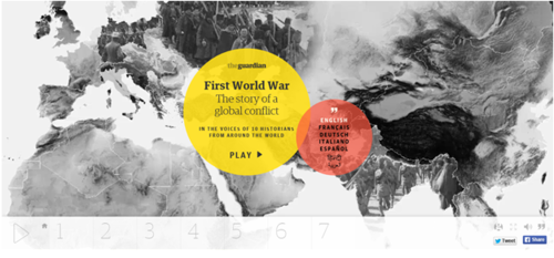
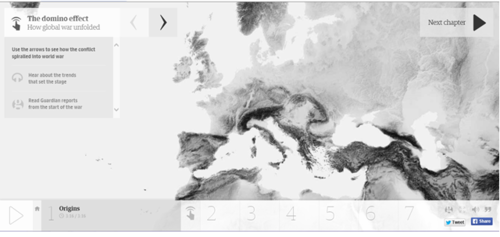
This screen shows the movement of the world at that time as a brief video in the map.
Let’s press the yellow circle (PLAY) as before.
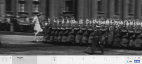
The first image is played.
In this video, along with the commentary, we explain the Origins of the
World War I. Before the outbreak of World War I, in Europe, culture and innovation along with innovation of science were rapidly changing.
And also the world powers for colonial contest were moving.
세르비아 청년이 오스트리아의 황태자부부를 암살로 인해 1차세계대전이 발발하였다.
이때 당사자인 오스트리아와 세르비아 외에 각자의 이권을 위해 선진 제국주의 국가 영국을 중심으로 프랑스, 러시아, 독일, 등이 개입하여
세르비아와 오스트리아와의 전쟁이 아닌 세계전쟁이 되었다.’
라고 말하고 있네요.
영상이 끝나면 다음과 같은 화면을 볼 수 있습니다.
이 화면에서는 ‘The domino effect(도미노 효과)’에 대해서 나타내고 있는데요.
연합국과 동맹국에 가입한 나라들을 순차적으로 보여주고 있습니다.
상단의 화살표 > 를 클릭해보겠습니다.
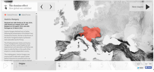
가장 먼저 오스트리아와 헝가리가 Central Powers(동맹국)에 가입했다는 것을 알 수 있습니다.
그리고 계속해서 > 화살표를 누르시면 연합국과 동맹국에 가입하는 나라들을 순차적으로 확인 할 수 있습니다.
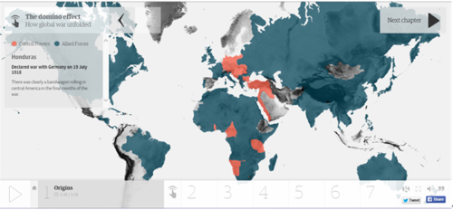
> 화살표를 계속해서 누르면 온두라스를 마지막으로 최종 연합국과 동맹국들을 한눈에 파악할 수 있습니다.
오른쪽 상단의 ‘Next chapter’ 버튼을 눌러 다음 단계로 넘어가보겠습니다.
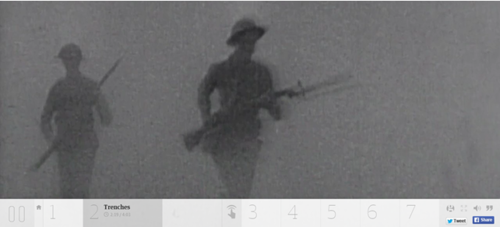
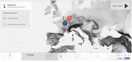
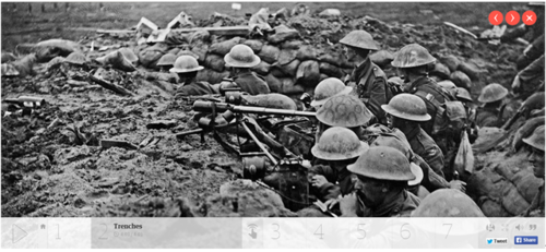
두 번째 챕터에서는 Trenches(참호)에 대한 영상과 함께 해설을 해줍니다.
‘전쟁시 참호전이 많았는데,
참호 속에서 웅크리고 서로 대치하는 시간이 길어지면서 전선은 고정되고 전쟁은 장기전으로 빠져들었고,
무모한 공방전이 며칠 동안 계속되기도 하였다.’
라고 말하고 있네요.
영상이 끝나면 다음과 같은 화면이 나오는데요.
좌측의 View photo gallery 버튼을 클릭해 보겠습니다.
다음과 같이 전쟁 당시의 사진들을 볼 수 있습니다.
붉은색 화살표 버튼을 눌러 다른 사진들도 볼 수 있고 X 버튼을 눌러 전 페이지로 돌아갈 수 있습니다.
전 페이지로 돌아가 View photo gallery 아래에 Guardian reports from the time버튼을 눌러보겠습니다.
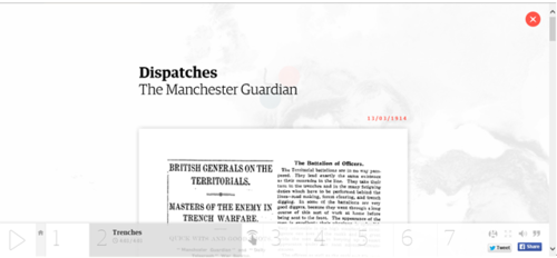
1914년도부터 1차 세계대전과 관련된 가디언 지의 기사들을 볼 수 있습니다.
그 당시에도 가디언 지가 있었다고 하니 얼마나 오래됐는지 감이 오시나요?
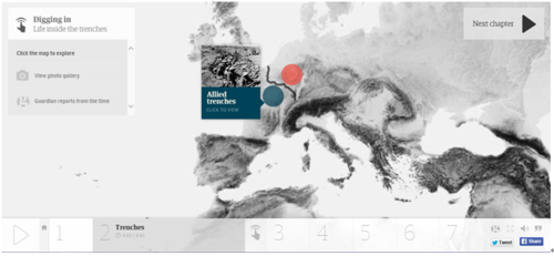
화면 가운데 지도를 보면 파랑색과 빨간색의 원이 있는데
클릭하시면 동맹국과 연합국의 참호에 관한 설명과 오디오 해설을 들을 수 있습니다.
나머지 챕터 3부터 6은 직접 확인해 보세요!
하단의 7 버튼을 눌러 마지막 챕터 7을 확인해보겠습니다.
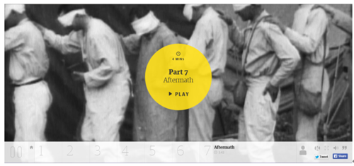
Press the yellow PLAY button to see Aftermath.
‘The war involved many nations, not only Southeast Asian countries such as Burma and Thailand, but also
many other countries, especially India, after which more than a million soldiers were fought for political advantage.
Also, as a result of the war, victims of civilians and many orphans, as well as war casualties, were born. ”
I’m telling you.
Did you understand the World War I?
The guardian documentary-style infographic is
not only an article but an innovative format that incorporates various digital technologies such as interactive maps, videos and images.
The historical view that deals with this as much as the format is unconventional.
In order to escape the western-centered view of the First World War, it conveyed the voices of soldiers and citizens who experienced wars in different regions.
Now that the importance of infographics is getting bigger
, I think it’s a great example of the Guardian that produced more innovative interactive infographic.
Experience interactive interactive infographics!
Experience the First World War of ‘the guardian’ The
news jelly that delivers offensive news with big data, public data, and social data
http://newsjel.ly/
