Hello, this is news jelly.
This article is an overseas article related to data visualization.
<TNW>
Article May 17, 2015
Seven of the biggest mistakes in data visualization
1. the numbers correctly to quantify not the case
When you draw a pie, stack bar, or stack area chart, you must enter up to 100 numbers. It might sound like an idiot, but when you look at this image of Fox News, you’ll be surprised at how many people are making this mistake.
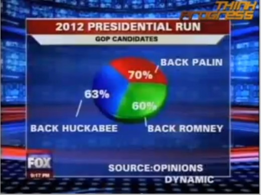
Do you see what’s wrong here? The three round fragments represent 193%, not 100%. The survey probably allowed more than one response, and the pie chart would not be a visualization that could clearly reflect this.
Also, if you only look at the size of the pie without reading the numbers, you will feel that each of the three candidates has a one-third approval rating. This is also the wrong conclusion.
To avoid this mistake, you need to double check the numbers and make sure you use the standard tools. These tools will not create the wrong pie chart as above.
2. If you do not follow the rules
As the pieces of the pie chart are represented within the number 100, the graph that moves up and down (see figure) is intended to represent growth by number. When you look at the chart below, can you tell what happened between 2005 and 2012?
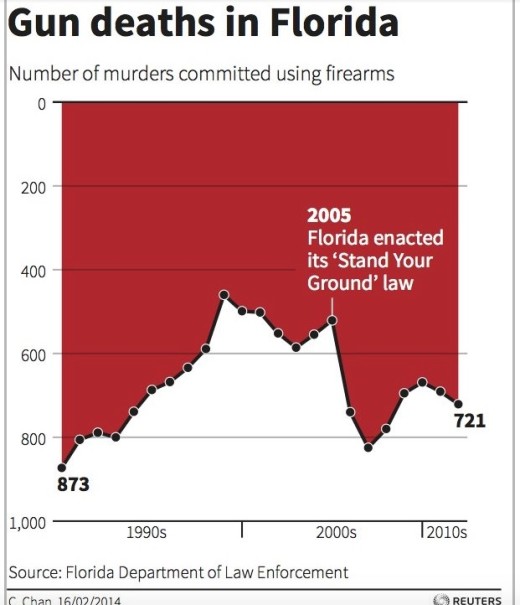
Generally you will think that firearms have declined in Florida from 2005 to 20012. But if you look more closely at the graph, you will realize that the y-axis is upside down. 0 is at the top and the maximum value is at the bottom. This is because the increase in y value does not follow the general rule of top-down.
You do not need anything special to prevent such mistakes. We all look at charts with general ideas and rules. Just do it so you do. There may be cases where you have to get out of these rules. However, it will be an exception, not a rule.
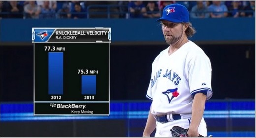
3. If the axis is excessively reduced
The axis tells you the context of the chart. If you are confused about using the axes, you will draw a completely wrong picture in your visualization. Let’s take a look at the graph below to understand what I’m talking about.
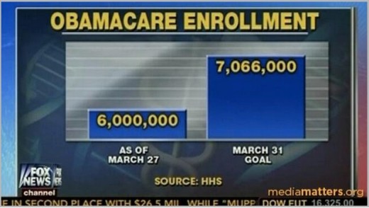
Fox 뉴스는 여기서 막대 그래프의 y 축 크기를 줄였습니다. 그래서 7백만이 6백만의 세배처럼 보이게 합니다. 이는 정말 잘못된 표현입니다. 아래 그림을 통해 같은 차트의 수정된 부분을 보여드리겠습니다.
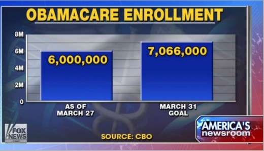
이게 좀 더 낫지 않나요? 이는 y 축에 데이터를 표시하고 좀 더 정확한 그림으로 수치를 보여줍니다.
여기에 같은 실수를 한 또 다른 사례가 있습니다.
당신이 Y 축에 대해 좀 더 신경을 쓴다면, 이런 실수를 방지할 수 있습니다. 이슈에 대해 상세보기를 표시해야 할 때, 먼저 큰 그림을 보여주고 그 다음에 특정 영역에 대한 수치를 두 번째 차트에서 표시해주면 됩니다.
4. 주석을 사용하지 않는 경우
사실 큰 실수는 아니지만, 당신이 차트를 그릴 때 확실히 체크할 만한 가치가 있는 것입니다. 때로는 시각화로만 보여주는 것이 충분하지 않습니다. 차트를 더 의미 있게 만들기 위해 텍스트나 숫자를 추가해야 합니다. 내가 말하는 포인트를 이해하기 위해 구글차트를 활용해서 만든 이 차트를 살펴봅시다.
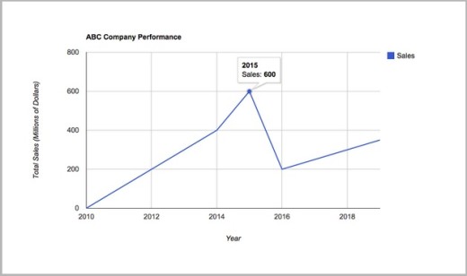
이 차트는 적절한 제목과 축 레이블을 사용한 좋은 차트입니다. 하지만 당신은 이를 볼 때 2015년에 무슨 일이 일어났는 지 궁금할 것입니다. “대체 왜 2015년에 판매 수가 급락했지?” 라며 말입니다.
이 질문에 대답하기 위해서는 하락 이유에 대해 적절한 주석을 표시해줘야 합니다.
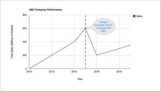
이게 더 좋지 않나요? 이를 통해 급락 발생뿐만 아니라 급락의 이유도 알 수 있습니다.
5. 부적절한 버블 크기의 사용
버블 차트는 2 차원으로 3 차원 데이터를 표시하는 데 매우 유용합니다. 당신은 X축과 Y축을 활용할 수 있을 뿐만 아니라 버블의 크기를 변화시킴으로써 그 양을 보여줄 수 있습니다.
지금까지 버블차트를 만드는 데 있어 내가 본 가장 일반적인 실수는 서로 다른 값을 표시하는 데 버블의 면적에 중점을 두는 대신 버블의 지름에 신경을 쓴다는 것입니다. 아래의 차트를 통해 설명해드리겠습니다.
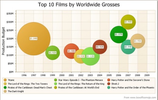
여기서 잘못된 것이 몇 가지 있는 데, 이는 가장 왼쪽에 있는 두 개의 버블을 통해 알 수 있습니다. 이들은 각각 $ 0.92B와 $ 1.84B를 보여줍니다. 하지만 이게 맞는 것 같나요? 더 큰 버블이 적어도 작은 버블의 네 배는 되는 것 같습니다. 그리고 당신이 버블 내부의 내용을 읽지 못한 다면, 차트를 오해하게 될 것이라고 나는 확신합니다.
이런 실수를 피할 수 있는 쉬운 방법은 만약 당신이 데이터를 비율로 표시할 때 지름에 치중하는 것이 아닌, 면적을 신경써야 한다는 것입니다.
6.불완전한 데이터 사용
당신은 아래에 있는 지도로 시장 점유율을 많이 가지고 있는 회사 알 수 있나요?
(FusionCharts를 사용)
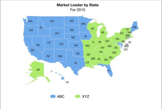
혼자서 위 지도를 바탕으로, 당신은 ‘ABC’가 높은 시장 점유율을 가지고 있다고 생각할 것입니다. 하지만 ‘그것은 불완전한 정보입니다’. 그 이유는 뭘까요? 우리는 확실히 ‘ABC’가 ‘XYZ’보다 미국의 더 많은 주에서 마켓 리더인 것은 알지만, 각각 주마다 두 제품의 매출의 양이 얼마인 지는 알 수 없습니다.
어쩌면, ‘ABC’는 모두 작은 시장에서 선두주자이고, ‘XYZ’는 모두 큰 시장에서 선두 주자일지 모릅니다. 그래서 더 큰 시장 점유율을 가지고 있는 회사를 알기 위해 우리는 더 많은 데이터가 필요합니다.
7. 비교하기 어려운 내용
Let’s say you are a business representative and you are in the global position of your current business. You want to compare the market share of your company in other countries. Why not try the chart below?
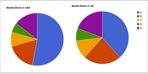
DataViz works by interpreting the data effortlessly. But in this case it is very difficult to compare the data. Do not you think the chart below will do a better job?
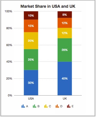
If you think from the point of view of the reader, you can avoid this mistake. Otherwise, we recommend that you get feedback from your colleague or friend before publishing the chart. Ask them: ‘How easy is it to interpret this chart?’, ‘Can you easily compare the two charts?’ Please ask. We also recommend using ‘labels’ if necessary. The first pie chart above does not have a label, but the second chart has a label.
Original article: http://thenextweb.com/dd/2015/05/15/7-most-common-data-visualization-mistakes/
Data visualization specialist, news jelly http://newsjel.ly/
Big data analysis based on data visualization with a flimsy idea
Storytelling content for the world
