#58 데이터 시각화 해외기사_미국의 가구 유형 TOP50
2016년 8월 9일
Hi Data Visualization is a professional company news jelly.
I have brought you an article on overseas data visualization for a long time 🙂 You waited a lot!
Today’s theme is ‘America’s most common family type’!
Recently, divorce, same-sex marriage, and various other family-related laws and institutions have emerged, and various family forms that were not seen in the past have begun to appear.
Statistian NATAN YAU has made 50 visualizations of the 50 most common family types in the United States, let’s look at it from now on!
<Original article>
Articles on 2016.07.20
Click link link
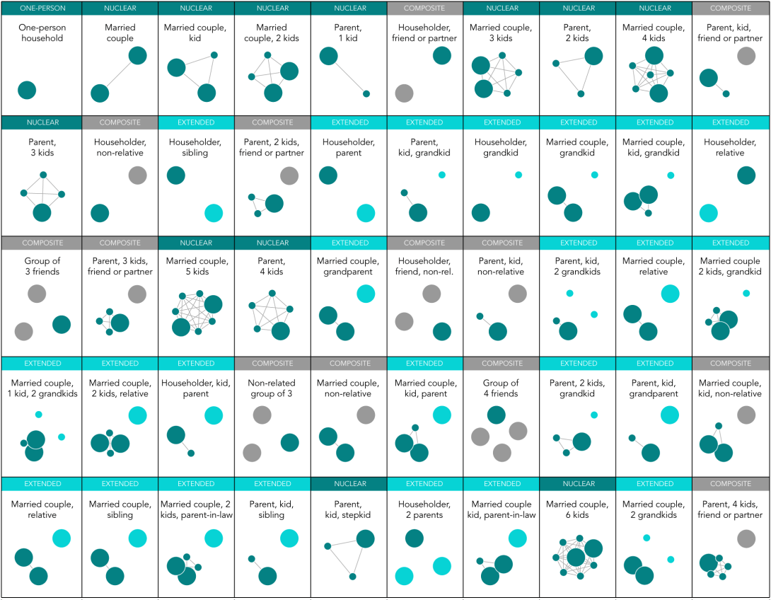
위 시각화 자료에는 ACS(American Community Survey)에서 조사된 5년간(2009-2014) 대략 10,276건의 가구 유형에 대한 데이터가 사용되었다고 합니다.
미국의 United Nations에서는 가구의 유형을 ‘ONE PERSON(혼자), NUCLEAR(핵을 가지는 형태), EXTENDED(확장된 형태), COMPOSITE(혼합된 형태)로 그 기준을 정의하고 있습니다.
NATAN YAU 는 이 기준에 따라 50가지 유형이 어느 카테고리에 속하는지 분류하는 과정을 우선적으로 진행했고, 그 유형과 세부 구성을 시각화 부분 위에 삽입하였습니다.
어떻게 분류되었는지를 알았으니, 이제 원의 크기, 색. 연결선의 의미를 알아야 데이터를 읽을 수 있겠죠? 여기에 사용된 시각적 요소는 3가지 색(진한 녹색, 옅은 녹색, 회색) 의 큰 원과 작은 원, 그리고 선 입니다.
큰 원들은 어른을, 작은 원들은 아이를 나타내고 있습니다. 진한 녹색은 가장을 비롯해 중심을 이루는 가족구성원을 표시한 것입니다. 그리고 옅은 초록색은 가족이긴 하지만 중심을 이루지 않는 사람들, 즉 손자나 자매와 같은 친인척 관계로 볼 수 있겠습니다. 마지막으로 회색은 아무런 관련이 없는 사람들이라고 합니다. 원 사이를 연결하고 있는 선은 결혼 혹은 가장을 중심의 혈연 관계를 나타냈다고 하네요.
이 50개의 가구 유형들은 미국 전체 가구 중에서 94%에 해당하는 유형인데요, 하지만 여전히 NUCLEAR 유형이 54%를 차지하고 있다고 합니다. 이 말을 조금만 바꾸어 보면 ‘46%에 해당하는 유형이 확장 혹은 혼합된 가족 형태다’ 라는 사실을 알 수 있죠?
Thus, Insight, which is available through the above data, suggests that “nuclear family composed of only blood relatives constitute more than half of US household types, “ but “extended or mixed family type is more than half of US household type Appearing “ .
The visualization material I introduced today shows that these furniture types are ‘Why?’ I do not know what kind of relationship it is, if it is not, or if it is not a blood relationship. But is there a fair amount of furniture that has been constructed in such a way, and the feeling of need to study a bit more about it will not make a big enough sense?
Next time, I will come back to the more informative and interesting foreign visualization articles. Please look forward to!
Add value to your data utilization.
Anyone can enjoy the data visualization solution “Daisy (DAISY)”
Daisy Inquiry: daisy@newsjel.ly
Introduction video: https://goo.gl/yVfIiY
Download brochure: https://goo.gl/IUrGOz
