Hello, this is news jelly.
The ninth international article on data visualization is related to New York’s ‘On Broadway’.
<FASTCODESIGN>
John Brownlee
Articles dated March 3, 2015
Huge data visualization brings the busy streets of New York to life
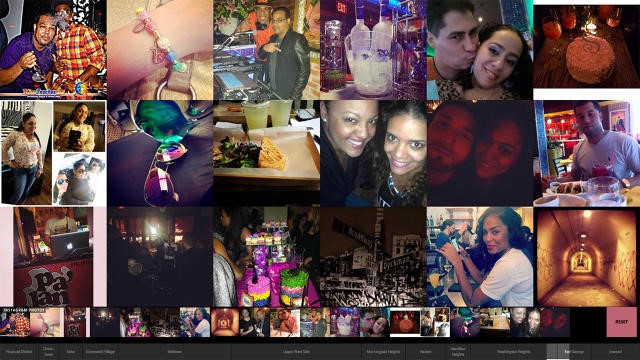
What does Big Data say about the characteristics of symbolic streets? Created by data industry maestros Moritz Stefaner and Lev Manovich, On Broadway brings unprecedented visualization of social media data by pulling data from social media such as Instagram, Twitter, Foursquare, Google Earth Review and more. And with the data piled up, Manhattan’s streets were turned into digital collections.
On Broadway was inspired by a book titled “All Buildings in Sunset Strips” in Edward Ruscha’s 1996 Panorama of about 25 miles, or 1.5 miles of Sunset Boulevard. On Broadway brought the concept to the 21st century. By running the app in your browser, you can see 13 miles spread from the center of Manhattan to the average number of tweets per day in the financial district, from the average color of the Harlem buildings.
According to Lev Manovich, who led the project, On Broadway is the latest in a series of experiments on computer, web, and vast amounts of data to represent our city.
“We wanted to abandon too general techniques like numbers, graphs and maps,” he said. Thus, we chose “a visually rich image-centric interface that does not have a map and the numbers perform only a secondary role”. The site shows Broadway as a collection of thousands of buildings in New York with a colorful, packed vertical image and data layer.
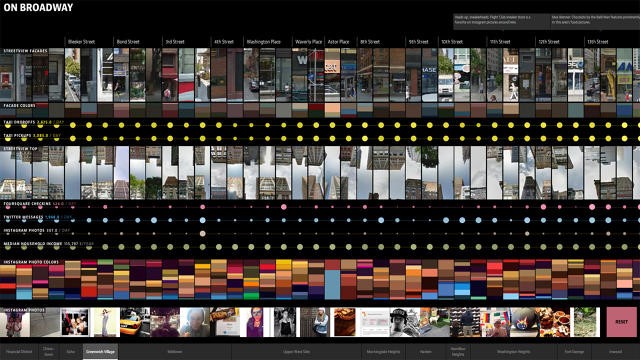
The most impressive thing about On Broadway is that this interface has everything in the end, and it shows a vast amount of data at a glance. To create On Broadway, the team collected 660,000 Instagram shots for five months in 2014, more than 80,000 Foursquare check-ins from 2009 to 2014, 220,000 cab information in 2013, Many of them used Google’s review images, Twitter posts, and US Census Bureau’s economic data. You can explore each part simply by clicking on the box below the site. On Broadway can also bring photos of each building, like Monk in the sign field, as you browse.
Because there is a lot of data, On Broadway does not have one big point. For example, you might learn that Columbia University is not well represented on Twitter, the city taxis are 30 times more expensive than Harlem or the average color is brown or blue. But as a result, Broadway is very lively and very complex. What you get from it depends on what you want from it. On Broadway is currently on display at the New York Public Library on January 3, 2016 via a bi-directional touch screen and is also available online.
News jelly that delivers quick news with big data, public data, and social data
