Hello, this is news jelly.
The third overseas article on data visualization is related to visualization guidance based on San Francisco’s crime rate data.
<SHARP SHIGHT LABS>
Article dated December 30, 2014
Sharpsight Admin
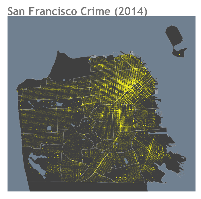
San Francisco Crime Mapping
When I was working as a data scientist at Apple in Silicon Valley, I drove to San Francisco to meet with my girlfriend every night and every weekend or to have dinner.
I fell in love with the city, and until recently, I checked the DataSF to create visualizations related to a specific area of San Francisco.
As is already known, crime data from places like Chicago and Philadelphia can be easily found. So I downloaded the crime data and started visualizing it with R software using ggplot ++ 2 (a data visualization package for statistical programming language R).
The map above is the finished result. This map is San Francisco crime data in mid-December 2014.
What is notable is that there are only 12 lines of code (self-generated code). And the vast majority of the twelve lines of code is just an alignment and a subtle modification that makes what I want for aesthetic features. (The look and feel of this was originally inspired by the map of spatial.ly about biking and pollution in London .)
library (ggplot2)
##########################
# GET CRIME DATA AND SF GEO DATA
######### ########################
# ——————————————
# Download the zipped SF crime data (2014)
# and save it to the working directory
# ————————————– —-
download.file (” http://www.sharpsightlabs.com/wp-content/uploads/2014/12/sf_crime_YTD-2014-12_REDUCED.txt.zip “, destfile = “sf_crime_YTD-2014-12_REDUCED.txt .zip “)
# ——————————
# Unzip the SF crime data file
# ——————- ——————-
unzip (“sf_crime_YTD-2014-12_REDUCED.txt.zip”)
# ————————————
# Read crime data into an R dataframe
# —- ——————————–
df.sf_crime <- read.csv (“sf_crime_YTD-2014-12_REDUCED.txt” )
#——————————
# Download water boundaries
# and neighborhood boundaries
#——————————
df.sf_neighborhoods <- read.csv(url(“http://www.sharpsightlabs.com/wp-content/uploads/2014/12/sf_neighborhood_boundaries.txt“))
df.sf_water <- read.csv(url(“http://www.sharpsightlabs.com/wp-content/uploads/2014/12/sf_water_boundaries.txt“))
################
# PLOT THE DATA
################
ggplot() +
geom_polygon(data=df.sf_neighborhoods,aes(x=long,y=lat,group=group) ,fill=”#404040”,colour= “#5A5A5A”, lwd=0.05) +
geom_polygon(data=df.sf_water, aes(x=long, y=lat, group=group),colour= “#708090″, fill=”#708090″) +
geom_point(data=df.sf_crime, aes(x=df.sf_crime$X, y=df.sf_crime$Y), color=”#FFFF3309″, fill=”#FFFF3309”, size=1.3) +
geom_polygon(data=df.sf_neighborhoods, aes(x=long,y=lat, group=group) ,fill=NA,colour= “#DDDDDD55”, lwd=.3) +
ggtitle(“San Francisco Crime (2014)”) +
theme(panel.background = element_rect(fill=”#708090″)) +
theme(axis.title = element_blank()) +
theme(axis.text = element_blank()) +
theme(axis.ticks = element_blank()) +
theme(panel.grid = element_blank()) +
theme(plot.title = element_text(family=”Trebuchet MS”, size=38, face=”bold”, hjust=0, color=”#777777″))
다르게 말해, R 소프트웨어에서 ggplot2을 이용해 지도를 제작하는 것은 그렇게 어렵지 않다는 것이다. 단지 ggplot2가 어떻게 작동하는지 이해하기만 하면 된다.
이전에 말했 듯이, ggplot2는 깊은 통사적 구조를 가지고 있다. 한번 그 구조를 알고나면, 겉보기에 복잡해 보이는 시각화 결과물들이라도 제작하기에 더욱더 쉬워질 것이다. 사실, ggplot2의 작동 방법에 대한 깊은 구조 덕택에, 이 지도는 기본적으로 섬세한 산점도이다.
분명히 하지만, 여기에는 필자가 보여주지 않은 많은 데이터 조작과 준비 작업이 있다.
또한 독자들은 이런 식으로 플롯을 구성하는 과정을 반복적으로 되풀이 해야 할 필요가 있다. 즉, 이런 식의 시각화 결과물을 제작하는 데 있어 디자인 프로세스에 대한 탄탄한 이해를 가지고 있어야 한다는 것이다.
그러나 그 중심에는, 이 시각화가 보기와 같이 그다지 제작하기에 어렵지 않다는 사실이 있다.
I will write step-by-step details on how to produce these visualizations. If you are interested in learning how to make these things, registering an email list will let me know when you can get detailed tutorials.
News jelly that delivers offensive news with big data, public data, and social data
http://newsjel.ly/
