Hello, this is news jelly.
Today, I would like to introduce you to Lyra through a content review of ‘Lyra: An Interactive Visualization Design Environment’, a paper on Lyra, a visualization tool.
- UW Interactive Data Lab
This paper is a paper from the UW Interactive Data Lab. I would like to briefly introduce this lab before introducing Lyra. The lab started with the Stanford Visualization Group, founded in the 1990s. Stanford Visualization Group, as part of the project by Professor Pat Hanrahan, is a co-founder of Tableau Software, a world-renowned visualization software. This lab covered projects such as D3.js, Protovis, and Data Wrangler. Jeffrey Heer, who was in charge of the lab in 2013, moved to the University of Washington and changed his name to the UW Interactive Data Lab. The lab is actively working on the interactive visualization part and is working to speed up the day when more people understand the data and communicate through the data.
- Overall introduction to Lyra
Lyra is an interactive environment that allows custom visualization design without the use of code, and the beta version of October 2014 was released and is still available for free. Lyra has a drag-and-drop interface similar to Tableau, but it is a visualization tool that has greater expressiveness than interactive systems like Tableau because it provides direct manipulation tools such as handles, marks, and connectors.
- Custom visualization
Custom visualization means you can visualize in the way you want. When constructing these custom visualizations, factors such as how effectively perceptually structured, how close to the reader can be approached, and how aesthetically beautiful are the main considerations. It is also one of the biggest considerations to try to convey the implications that are contained in the data through visualization as well as the above elements. Visualization that takes all of these factors into account enables effective communication and user interest.
- The Role of Visualization
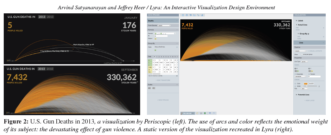
The visualization above is a visualization of the data for people who died in a firearm accident in Periscopic in 2013. From there, the orange line represents the life of the victim, and the gray line represents the life expectancy of the victims. Through this visualization, the reader will feel the sadness of the victims of a gun accident. Data visualization is now evolving from delivering statistical information or elements to delivering emotional weight through unique visualizations.
- Lyra’s strengths through related research
Many Eyes와 Google Fusion Tables와 같은 온라인 서비스나 스프레드 시트에서 찾아볼 수 있는 차트 템플릿들은 시각화를 만드는데 기본적으로 이용됩니다. 그러나 이 경우 차트 타입에 대하여 팔레트가 이미 구성되어 있기 때문에 표현력 대신 효율성을 택하여, 새롭거나 풍부한 시각화는 어려운 게 가장 큰 단점이라고 할 수 있습니다. 그렇지만 Lyra는 프로그래밍 언어를 몰라도 이러한 한계를 극복하여 더 다양한 시각화 디자인이 가능하다는 것이 강점이라고 할 수 있습니다.
또한, 다양한 시각화 도구모음은 커스텀 시각화를 위해 개발된 것임에도 불구하고 새로운 시각화를 만들기 위해서는 프로그래머의 역할이 필요하다는 것이 어려움이였습니다. Lyra는 앞에서 언급했던 것처럼 프로그래밍 언어가 필요없기 때문에 덜 기술적인 이용자들도 커스텀 시각화를 할 수 있다는 것 역시 큰 강점 중 하나입니다.
Lyra는 직접적 조작 기술을 사용하고 있습니다. 이러한 기술은 Vector-based drawing tool이나 Adobe Illustrator의 기술인데, 시각화에 특화되지 않은 도구들의 기술을 Lyra에 도입했다는 것도 눈 여겨 볼만 한 특징이라고 할 수 있습니다. 또한, Lyra의 인터페이스는 Tableau와 Polaris의 영향을 받은 것이지만, Tableau가 효율적인 시각화를 강조하는 반면, Lyra는 풍부한 디자인적 컨트롤을 가장 큰 목표로 하고 있습니다.
- Lyra의 디자인 소개
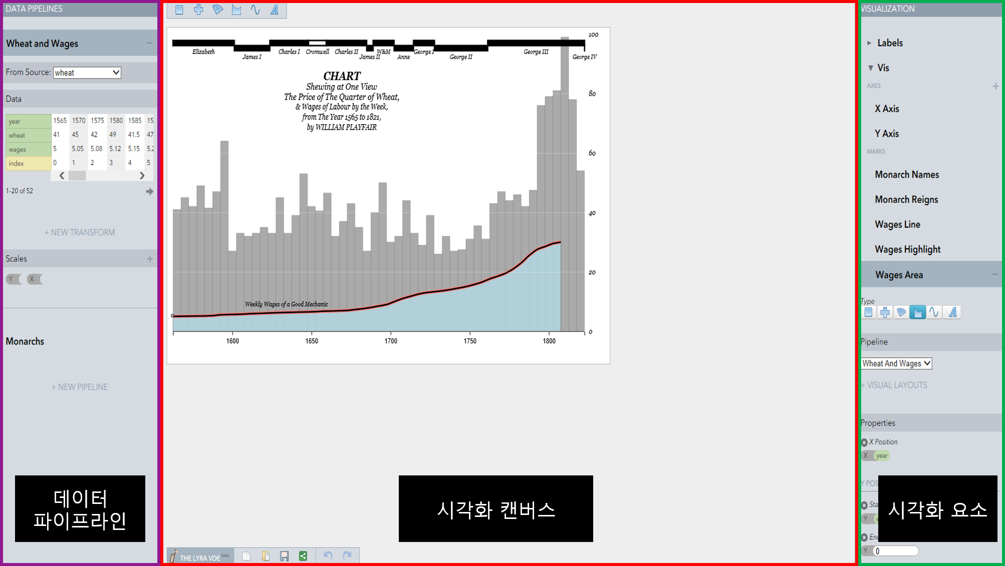
위의 그림은 Lyra의 실행 화면입니다. 위에 표시되어 있는 것처럼 Lyra의 인터페이스는 크게 세 부분으로 나누어져 있습니다.
– 데이터 파이프라인 : 데이터 파이프라인은 데이터를 보여주는 데이터 테이블과 더불어, 통계적인 데이터를 시각적인 요소로 인코딩하는 과정인 ‘Transformation’을 담당하는 부분입니다. 이는 Bret Victor의 영향을 받은 레이아웃으로 여러 데이터들을 종합하여 다채로운 시각화 제작을 가능하게 합니다.
– 시각화 캔버스 : 시각화 캔버스는 만들어진 시각화를 직접 보고, 수정할 수 있는 부분으로 좌측 상단에 위치한 6개의 마크를 하나를 드래그하여 캔버스에 끌어와 데이터 파이프라인에 있는 필드를 넣으면 자동적으로 시각화가 가능합니다.
– 시각화 요소 : 가장 우측에 위치한 시각화 부분은 레이어 및 그 구성요소를 확인하고 설정할 수 있는 부분입니다. 색깔이나 크기를 조정할 수 있는 부분으로 이를 통하여 이용자의 필요와 기호에 맞는 시각화 제작이 가능합니다.
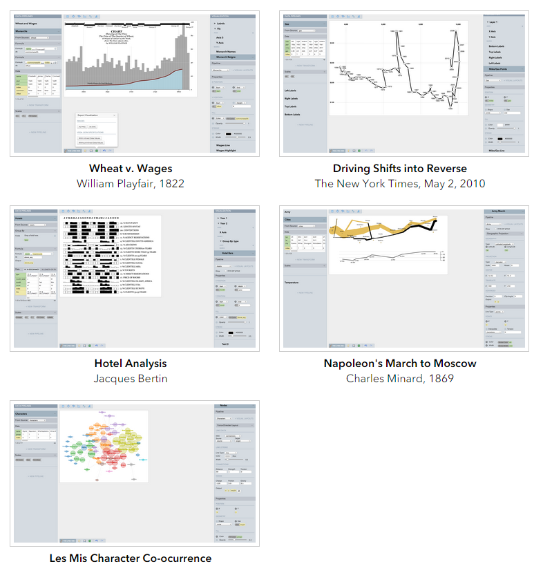
- Lyra를 이용한 시각화 예시
- Lyra에 관한 시각화 디자이너 / 데이터 저널리스트 / 대학원생 연구
Lyra의 강점과 약점, 그리고 전반적인 활용도를 알아보기 위하여 개발자는 연구를 진행하였습니다. 연구 결과, 모든 이용자들은 Lyra라는 시각화 환경에서 기술적인 전문도와 상관없이 쉽게 이해하고, 3가지의 과제를 최소한의 가이드만을 가지고 성공적으로 수행했습니다. 또한 연구에 참여한 참여자들은 Lyra에 대하여 매우 자연스럽게 구성되어 있고, 직관적으로 구성되어 있다며 Lyra의 활용도에 대하여 만족의 의견을 전했습니다.
Lyra has the greatest significance as being a useful tool that enables custom visualization to a wider audience without technical knowledge. With Lyra, users will be able to succeed in creating useful visualizations that are easy, fast, and beautiful to match their needs and preferences.
Data visualization, which represents a massive amount of data in a flood of data in a simple and intuitive way, is recognized for its usefulness, and nowadays, why not become a direct data visualization designer?
If you are interested in using Lyra, you can try it out directly below.
http://idl.cs.washington.edu/projects/lyra/app/
News jelly that delivers quick news with big data, public data, and social data
