Hello, this is news jelly.
The second overseas article related to data visualization is related to the best visualization project that can look back on 2014 year.
<GIZMODO>
Articles dated December 22, 2014
Nathan You
2014 Best Data Visualization Project
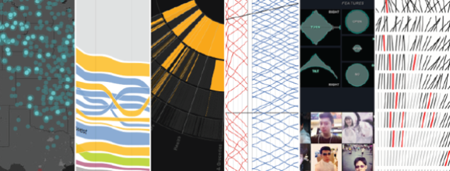
Choosing your favorite visualization project is always a challenge. That is, choosing and ranking your favorite stuff is really a challenge. Though I was very much focused on those challenges, I had a lot of great visualizations this year. Nevertheless, I try to make a choice once.
These results are my favorites of the year, roughly listed in order from the bottom of my list to the bottom of my list, and the choices are due to the use, design and usefulness of the data. However, most of these choices are due to my intuition.
One unintended theme is that all the choices I have chosen are ‘interactive artifacts, animated artifacts, or both.’ I think this theme is probably the beginning of the writing.
The Upshot
Last year, when Nate Silver left, the New York Times had a data-centric hole to fill. And the New York Times went through the hole with a more upshot, the New York Times’ new news site to fill Nate Silver’s vacancy. On the other hand, 538 (FiveThirtyEight: Nate Silver’s data journalism site) kept their charts simple as it was with the New York Times in the past, while the upshot took advantage of the skilled internal graphics department (with a few new employees ). And while I realized that the upshot was more than just a data graphical machine, it might have been what it looked like.
If I had not gathered more upshot visualization projects in one place, the individual outputs would dominate the project list.
Here are some of my favorite projects.
1. Where we came from and where we went
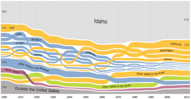
The state-by-state migration charts are also fun and playful, as there is no doubt about the popularity of the dialect problem map at the end of 2013 . Gregor Aisch, Robert Gebeloff, and Kevin Quealy expressed the band on a customizable, comparable area chart.
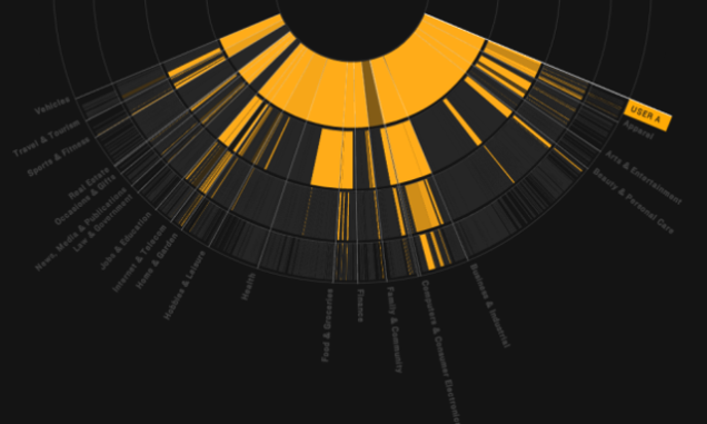
2. The most detailed map you will see in the midterm elections
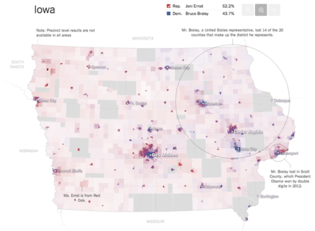
The Senate results map of the midterm election this year was impressive. It features the most elaborate electoral districts, high availability, and alpha for representative population density.
3. How the recession changed the shape of the economy in 255 charts
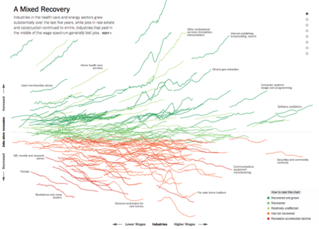
If I remember correctly, this chart, showing job recovery and loss , is one of the first large-scale projects on the upswing. When you start scrolling, the lines show an explosion as you show the data’s descent and highlight points.
More upshot projects can be found here .
4. Visualization Algorithm
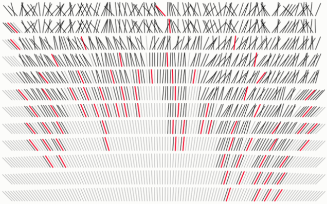
마이크 보스톡(Mike Bostock)은 시각화를 가지고 많은 훌륭한 작업들을 한다. 시각화 알고리즘(Visualizing Algorithms) 또한 그 중 한가지다. 보스톡은 분류, 샘플링, 그리고 복잡한 세대들을 위한 넓은 배열의 과정과 패턴들을 입증했다. 결과는 자원을 얻는데 유용했고 대부분의 사람들이 도전이라고 상상하는 것에 대한 감사와 다름없었다.
5. 시각화 MBTA(Massachusetts Bay Transportation Authority)
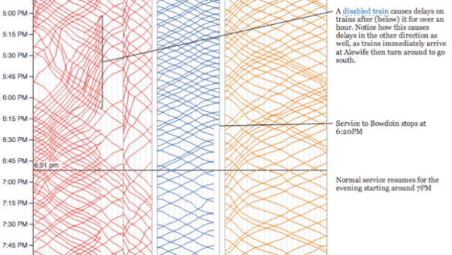
몇몇 훌륭한 프로젝트들은 새로운 기술을 배우고 있고 무엇이 작동하고 무엇이 작동하지 않는지를 알아내려는 학생들에 의해 탄생된다. 필자는 이것이 시간의 유용성과 지식을 흡수하려는 열망의 조합에서 나온다고 생각한다. 마이클 베리(Michael Barry)와 브라이언 카드(Braian Card)는 그들의 시간을 보스턴의 지하철 시스템에 관한 데이터를 시각화(visualize public data about the Boston subway system)하는데 사용했다. 시간의 연쇄에 관한 시각화를 동반하고 있는 작은 지도는 탐구결과들 사이에 좋은 연결 고리를 제공해 준다.
6. 셀카도시
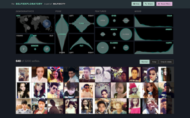
필자가 어디 있었는지는 잊어버렸지만, 예전에 어딘가에서 커피를 마시고 있었고 밖에는 비가 내리기 시작한 때가 있었다. 그 때 필자는 사람들이 어딘가 비를 피할 곳으로 가는 것을 보았다. 그런데 당시에 몇몇 십대들이 셀카를 찍기 위해 길 위에 그대로 서있는 것을 보았다. 그 광경은 꽤 이상하게 느껴졌다. 그리고는 필자가 이에 관해 문외한이라는 것을 느꼈다. 필자는 그 문화를 이해하지 못했지만, 레브 마노비치(Lev manovich), 모리츠 스테파너(Moritz Stefaner), 그리고 그들의 팀이 만든 셀카도시(Selfiecity)는 그 문화를 분석하는 좋은 결과물이다. 매케니컬 터크와 안면 인식 소프트웨어의 사용은 당신의 기본적인 사진을 가져와 등급별로 모자이크한다.
7. 기온 편차
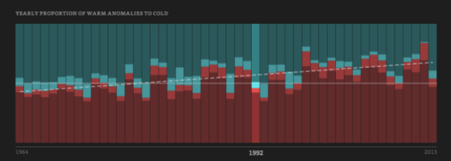
기후는 점점 따뜻해질까? 점점 추워질까? 기후 변화를 다루는 것은 무엇이고 정녕 그 요인들이 다 일까? Enigma.io는 미국의 따뜻함과 추위의 변화(warm and cold anomalies in the United States)를 찾기 위해 몇 가지 기본적인 통계들과 공개적으로 접근 가능한 기온 데이터를 이용했다. 그리고 그들은 1964년에서 2013년까지의 매일의 데이터를 움직이게 만들었다. 그 지도는 마음을 사로잡았고, 시각화 전의 약간의 분석도 무언가를 할 수 있다는 것에 대한 좋은 사례였다.
8. 광고홍수주의보
우리는 대부분의 온라인 사용자들이 자신들의 행동이 광고주들에 의해 추적당하고 있다는 사실을 알고 있는 이상한 시점에 있다. 그러나 상당 수는 이에 대해 별로 신경쓰지 않는 것처럼 보인다. 크리에이티브 리서치와 아쉬칸 솔타니(Ashkhan Soltani)가 만든 크롬 플러그인인 광고홍수주의보(Floodwatch)는 사용자에게 오는 광고를 추적해 준다. 이 프로젝트는 (1) 사용자로 하여금 자신의 배너 히스토리를 돌아보게 해주고 (2) 조사자에게는 제공되는 배너 블랙 박스를 찾을 수 있는 기회를 제공한다. 그렇다면 이젠 아마도 더 많은 사람들이 광고에 대해 관심을 갖게 될 것이다.
9. 거짓된 상관관계
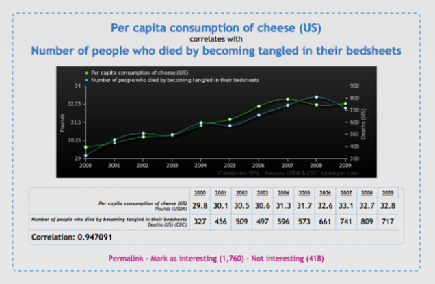
우리는 오늘날 대부분의 상관과계가 인과관계의 과장이 아니라는 것을 들어봤을 것이다. 그렇지만 가끔, 과장은 사람들이 사실상 이해하지 못하는 빈 말같이 느껴지기도 한다. 타일러 비겐(Tyler Vigen)의 거짓된 상관관계(Spurious Correlations)는 요점을 이끌어내고 과정 상의 재미를 제공한다. 대략 1분에 한 번씩, 비겐의 스크립트는 무작위로 연관된 것들을 모으고 텀블러(패션과 같은)를 통해 흩뿌린다.
10. 3차원 공간 어디에나 위치할 수 있는 전시 요소(Spaxels)

아스 전자 미래실험실은 LED가 장착되어 있고 4개의 프로펠러를 가진 드론(quadcopter drones )을 구축하고 편대로 비행할 수 있도록 프로그래밍 했다. 이는 지상에서 컨트롤 될 수 있다. 이것은 데이터 시각화는 아니지만, 상공을 날아다닐 수 있는 픽셀이라는 측면에서 꽤 멋지게 느껴진다. 더 진화된 도시 경보라고? 구름에 의존하지 않는 배트맨 신호라고? 상공에 쓰여지는 낭비스러운 결혼 프러포즈라고? 그렇게 접근하기 보단 그저 가능성에 대해 상상해보도록 하자.
11. 문화 역사
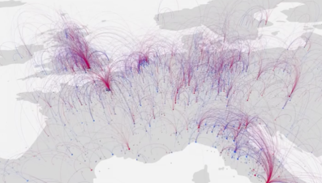
조사자들은 “유명한 개인들”의 생일과 사망장소를 지리적 문화 역사의 대용물 (a proxy for geographic cultural history)로 이용한다. 전제는 만약 많은 사람들이 어딘가로 이동하고 그들의 마지막 여생을 그 곳에서 보냈다면, 그 장소는 거의 의미있는 정보를 가지고 있을 가능성이 많다는 것이다. 그렇기 때문에 이것은 단순히 이동만을 나타낸 지도가 아니다. 파란색과 빨간색으로 나타나져 있는 둥근 모양의 연결성은 아마 꽤 많은 의미를 나타낼 것이다.
12. 난민 프로젝트
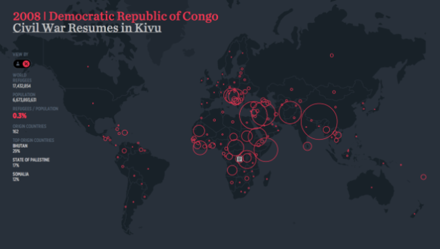
The interactive results produced by Hyperact and Ekene Ijeoma show the United Nations estimates for refugees around the world from 1975 to 2012 from 1975 to 2012 . Having good aesthetic features and usefulness, calling on things in history is making the refugee project go back.
News jelly that delivers offensive news with big data, public data, and social data
http://newsjel.ly/
