Hello, this is news jelly.
The eighth international article on data visualization is related to data journalism lessons using Lego.
<AMERICAN JOURNALISM REVIEW>
February 2, 2015 Article Aysha Khan
Journalism Professors How to Use Lego to Teach Visualization of Super Bowl Data
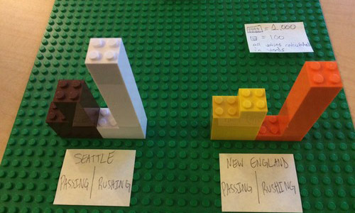
Credit: courtesy of Matt Waite
Matt Weid’s Journalism 491 Students in data visualization courses use Lego, which can range from a narrow 100 yards to a wide 1,000 yards. Based on that, the visualization shows that Seattle is ahead of New England over the season and New Anglard has more pass yards.
Just as journalism schools across the country compete, they are trying to teach students new technologies along with rapidly changing industries such as data visualization. Matt Weights has an idea on this.
It is at this very early stage of teaching specific complex skills to leverage Lego.
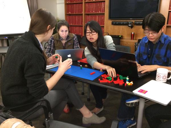
Weighs in from this month, when he proposed to students how to use Lego to visualize Super Bowl data in his data visualization class.He describes his students the differences between the Seattle Seahawks and the New England Patriots We proposed to use Lego for. (Wait cautiously says he was not the first attempt to use Lego for data visualization, but he said he would do it again.)
“They immediately visualized a topic and discussed how the Legos would make sense,” Weights said in his tumbler account. “It was fantastic to discuss how the scale of the chart and Lego should be structured on the X and Y axes.”
“Building the foundation for visualization allows students to focus on data rather than the complexities of software tools,” said Weights, a professor in the Department of Journalism and Mass Communication at Nebraska-Lincoln University.
“I think the mistake I’ve made so far has not taught mental tools so much, so we have a sort of gap in the way students have started using the software,” Wait told AJR.
Sometimes the best ideas are simple when working with data. And it can not be simpler than a LEGO block.
“Lego makes it possible to focus on the shape of the data,” says Weights. “There,” I missed the semicolon? ” There are no such questions as “Did I use the wrong function? Did I press the wrong button?”
그러나 그가 말하길 아직 그의 레고 전략이 더 효율적이라고 확언하기엔 이르다고 지적했다. “지금 당장은 올바른 것처럼 느껴질지 모르나 우리는 이 전략이 언제 확실해 질 수 있는지 알아낼 것이다.”
웨이트가 그의 교육 경험을 포스팅한 후에 스탠포드 저널리즘 강사인 셰리 필립스와 비네쉬 라마찬드란은 역시 슈퍼볼 데이터를 시각화하기 위해 그들의 수업에 레고를 사용했다.
레고 아이디어는 어려운 코딩 개념에 접근하기 전에 시각화의 기본적인 개념에 대해 배울 떄 사용되는 인포그램이나 타블로 퍼블릭과 같은 간단한 툴을 이용한 교육 방법에 불어닥친 엉뚱한 바람과도 같다.
웨이트는 이 아이디어가 매쉬어블의 “완벽한 광명”이라는 2014 중간고사 결과의 레고 타임랩스 회의에서 도출되었다고 말했다.
그는 데이터 팀의 기술과 데이터에 박학한 사회를 촉진하는 국제적 네트워크의 일환인 개방 지식 재단의 학교의 일원인 자라 라만의 이름으로 개설된 레고 저널리즘 기관의 오프닝에 관한 농담을 트윗 했다.
9월, 그녀는 상품 가격과 세계 은행의 인도네싱 경제 발전 지표에 대한 레고 데이터 시각화를 주제로 하여 자카르타와 인도네시아에서 진행되는 워크샵을 도왔다.
저널리즘에서 레고가 스토리텔링 툴로써 역할을 다하는 것은 새로운 것이 아니다. 2012 올림픽 기간 동안 가디언지는 펜싱 경기를 힘들여 복원하기 위해 스탑모션 비디오에 레고를 이용했다. 그들은 또한 그들의 2014 월드컵 “brick-by-brick” 시리즈의 이야기를 전달하기 위해 레고를 사용했다.
It is not the first time Lego has been used to visualize data. Samuel Granados, an infographic journalist currently serving as senior graphic editor for the Washington Post, created a 3D catogram in the US visual transitions in 2011.
One year later, General Motors and Wellstar Health Systems will use the LEGO block to track the process of ‘everything in car repair for patient care’, using color and size to bring life into trouble. Developed a visualization system.
Why did Leight’s activity in Weights cause topics among data journalism educators?
“Frankly, I thought that Lego was just a toy for kids to play with,” he said.
“But there is actually nothing more complicated than that.”
News jelly that delivers quick news with big data, public data, and social data
